PROJECT OVERVIEW
Client
TMM
Industry
Matrimonial Technology
Role
UX Designer
NDA briefly shown - reach out for the full process.
TMM is a matchmaking app designed exclusively for getting married people to browse verified profiles efficiently. It streamlines traditional matchmaking workflows like shortlisting, calling, sharing, and updating profile information. With premium features and mobile-first usability, it empowers matchmakers to deliver faster, personalized matches for their clients.
PROBLEM
The matchmaking app, while functionally important, lacked a modern UI and presented several UX challenges including small tap targets, slow workflows, unclear filter states, and insufficient support for daily repetitive tasks. These issues created friction for people trying to manage and act on profiles efficiently.
SOLUTION
The redesign focused on elevating the interface with a modern, minimal visual system, enhancing touch accessibility, redefining key user flows for efficiency, and resolving filter inconsistencies. Contextual call-to-actions were strategically introduced to support quicker decisions, reduce cognitive load, and streamline daily tasks for users.
PHASE ONE
RESEARCH
Starting with user anecdotes and recurring feedback, I uncovered top pain points in the current app including repetitive tasks, unclear navigation, and friction in performing key actions. These patterns often led users to fall back on external tools to manage their workflow.
To deepen my understanding, I conducted a heuristic evaluation based on Nielsen’s principles and a custom usability matrix. This helped reveal key usability issues and gauge the overall health and efficiency of the app experience.
PHASE TWO
EXPLORATION
Guided by user insights, I reframed the core design challenge into a “how might we” question to uncover opportunities for streamlining the experience.
I began with quick sketches and notes on paper, mapping out high-level flows and touchpoints before narrowing into detailed experience enhancements.
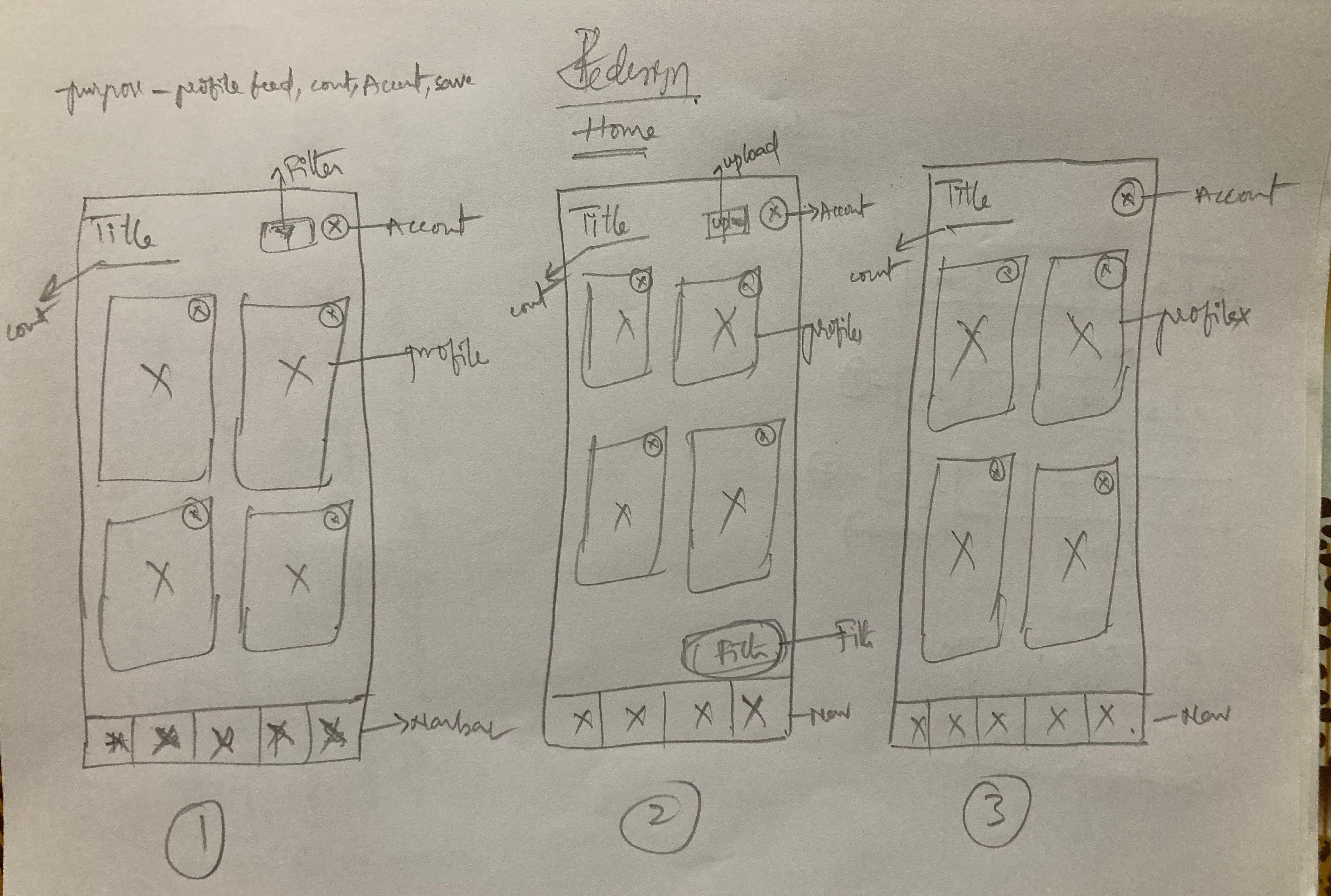
PHASE THREE
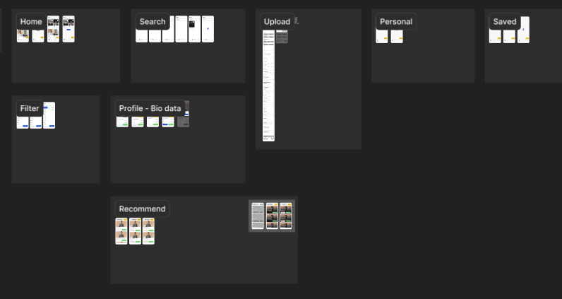
UI
Due to the confidential nature of this project, several visuals and process details have been intentionally excluded or replaced. Feel free to reach out directly for further context.
SOLUTION
Redesigned Alpha Marine Services' platform with intuitive navigation, clear service categorization, and improved accessibility. Optimized the user experience by streamlining workflows and enhancing service discoverability.
PROBLEM
Alpha Marine Services' platform had navigation and usability challenges, making service discovery inefficient. A user-centric redesign was needed to enhance accessibility and streamline the user experience.
PHASE TWO
EXPLORATION
Guided by user insights, I reframed the core design challenge into a “how might we” question to uncover opportunities for streamlining the experience.
I began with quick sketches and notes on paper, mapping out high-level flows and touchpoints before narrowing into detailed experience enhancements.
PHASE THREE
UI
Due to the confidential nature of this project, several visuals and process details have been intentionally excluded or replaced. Feel free to reach out directly for further context.
PHASE ONE
RESEARCH
Starting with user anecdotes and recurring feedback, I uncovered top pain points in the current app including repetitive tasks, unclear navigation, and friction in performing key actions. These patterns often led users to fall back on external tools to manage their workflow.
To deepen my understanding, I conducted a heuristic evaluation based on Nielsen’s principles and a custom usability matrix. This helped reveal key usability issues and gauge the overall health and efficiency of the app experience.
Crafted with 💜 on Framer. All Rights Reserved © 2025 Thirumalesh.
Crafted with 💜 on Framer.
All Rights Reserved © 2025 Thirumalesh.
Crafted with 💜 on Framer.
All Rights Reserved © 2025 Thirumalesh.